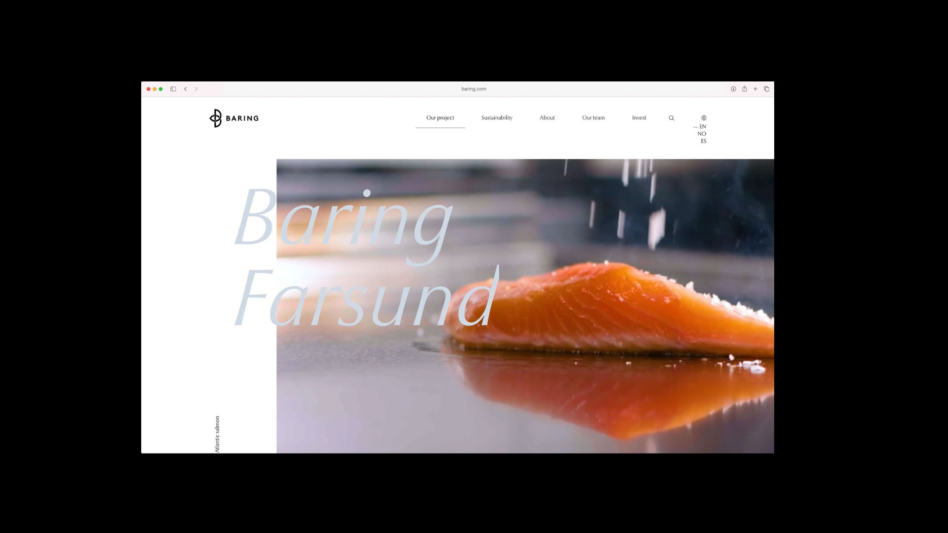
Baring
Brand Identity
From proud maritime traditions to the future of food production.
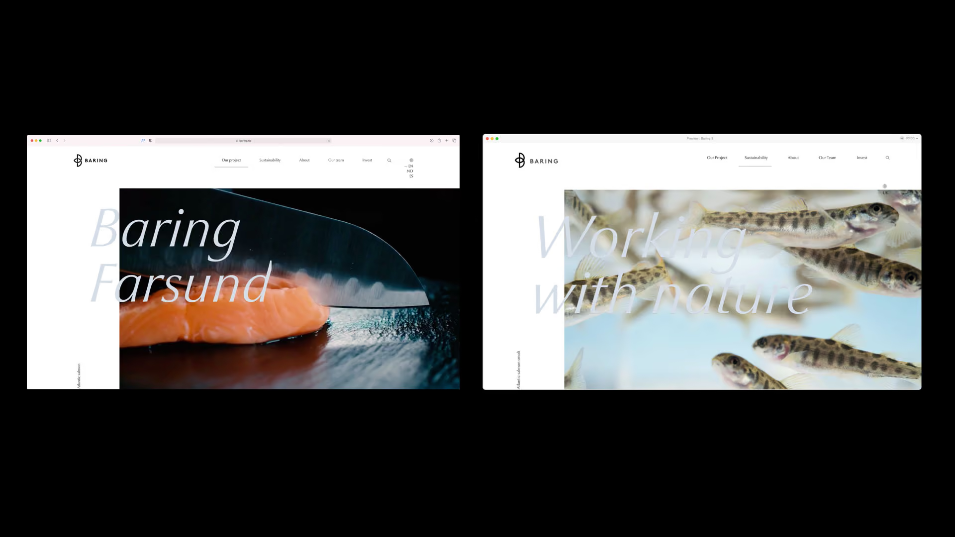
In Farsund, where Viking ships once sought shelter and merchants set sail for distant shores, a new industrial adventure is taking shape. Baring Farsund combines Norway’s maritime heritage with modern technology and the ambition to create a more sustainable future for salmon farming. With its land-based facility in Lundevågen, this vision has become a reality, placing innovation, fish welfare, and environmental responsibility at its core.
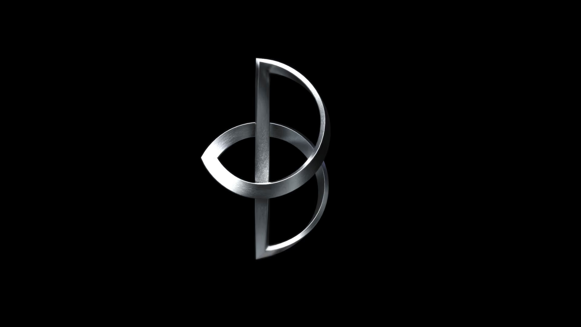
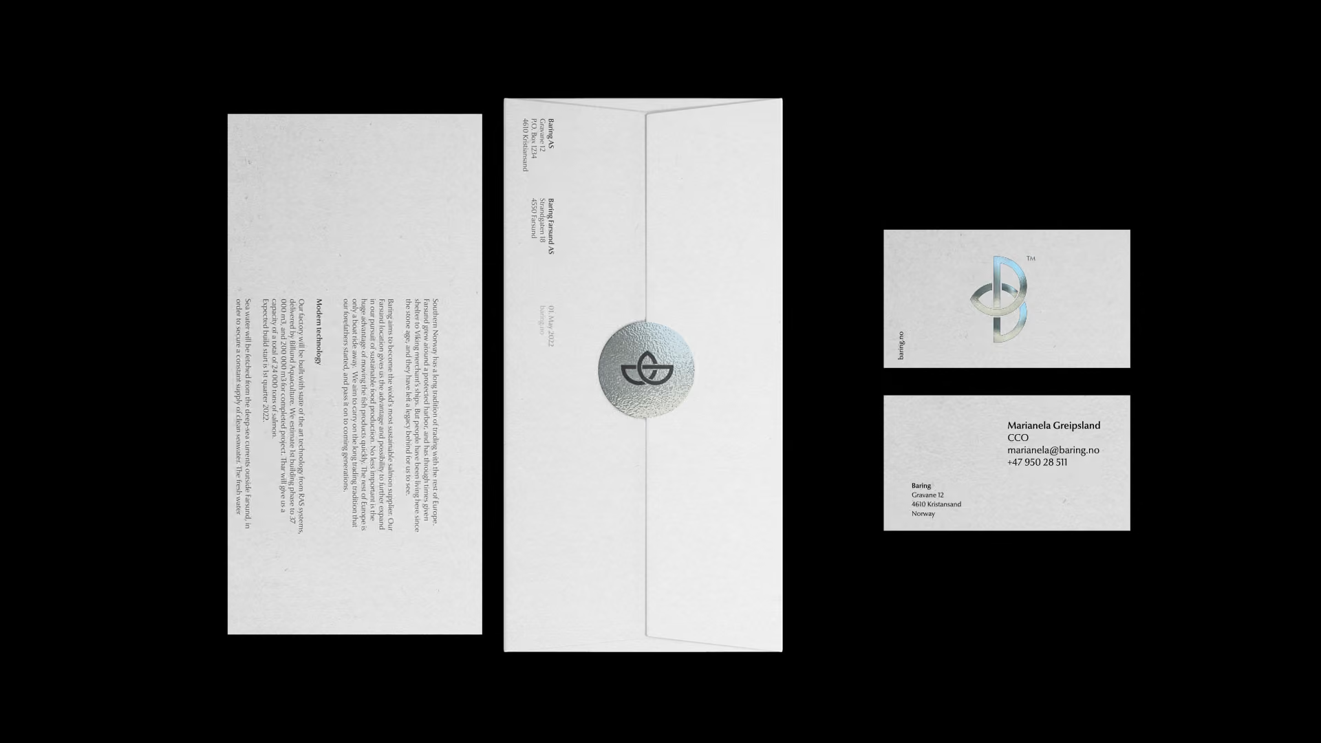
The visual identity is rooted in the values Fresh, Norwegian, Fearless. We have created a symbol where the letter B intertwines with the infinity symbol, inspired by the intricate patterns and ornamentation of the Viking Age. A design that connects the voyages of the past with the possibilities of tomorrow. The logo unites tradition and technology, representing a company that dares to think differently, rooted in history and looking boldly toward the future.
No items found.